
Appearance
Navigating This Documentation Portal
A short orientation to the portal's own navigation, search, and content conventions — useful if you are new to the site, or contributing pages to it.
On a wide enough window, the top navigation bar, left sidebar, and right-hand page outline are all visible together:
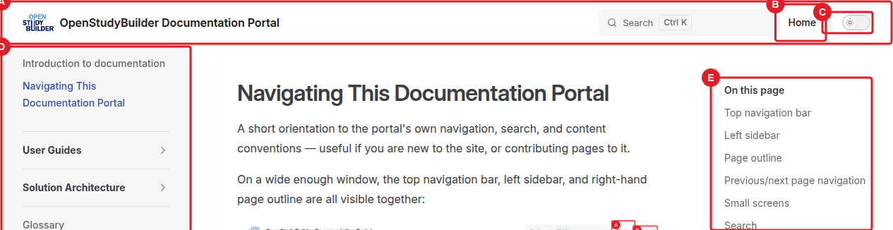
On narrower screens the sidebar and outline no longer fit and collapse into the Menu and On this page buttons instead — see Small screens below.
Top navigation bar
The bar across the top of every page (A) carries the site logo/home link and the search box, a Home link (B) back to the landing page, and a light/dark theme toggle (C).
Left sidebar
The left sidebar (D) lists every page grouped by topic (User Guides, Solution Architecture, Glossary, …). Groups with an arrow are collapsible — click the group title to expand or collapse it. The current page is highlighted so you can see where you are within a group.
Page outline
On wide screens, the right-hand column (E) lists the headings of the page you're on ("On this page"). Click a heading to jump straight to that section; the entry currently in view is highlighted as you scroll.
Previous/next page navigation
At the bottom of each page, a pager links to the previous and next page in the current sidebar section — a quick way to read a set of guides end to end without going back to the sidebar each time.
Small screens
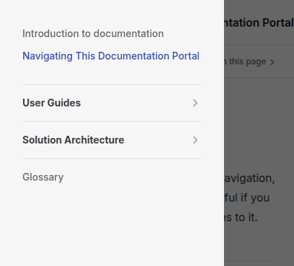
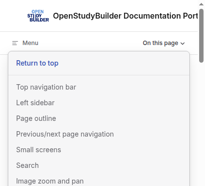
Below a certain window width the sidebar and page outline no longer fit alongside the content, so they collapse into two buttons at the top of the page:
Menu opens the left sidebar as an overlay you can scroll and select from; tap outside it, or select a page, to close it.
On this page opens the same heading list from the page outline as a dropdown.
Search
Use the search box in the top bar (or press Ctrl/Cmd + K) to search page content across the whole portal. Results are indexed locally, so search works without contacting any external service.
Image zoom and pan
Screenshots in the guides are clickable. Click an image to enlarge it; once enlarged you can:
- scroll the mouse wheel (or pinch, on touch devices) to zoom in further
- click and drag to pan around a zoomed-in image
- click again, or press Esc, to close it
This is most useful on dense dashboard screenshots where the lettered call-outs are hard to read at normal size.
Callout boxes
Guides use five callout types to flag information by importance:
NOTE
Supplementary information that's useful context but not essential to the task at hand.
TIP
A helpful shortcut or suggestion that makes a task easier.
IMPORTANT
Information you need to know before continuing, e.g. a prerequisite.
WARNING
A risk that needs your attention to avoid an unwanted outcome.
CAUTION
A serious risk, e.g. of data loss or an action that can't be undone.
Collapsible "Show Quick Guide" sections
Report and user guide pages keep their step-by-step instructions inside a collapsed section:
Show Quick Guide
Click the section title to expand it. This keeps the page scannable — you see the tab/section overview first, and only expand the detailed steps for the part you're actually working on.
Some pages also include a Show Solution Architecture section, using the same collapsible pattern, for readers who want the underlying data model rather than click-by-click steps.